.png)
The meat of the content for your landing pages and blog posts is important for establishing authority and trust with readers and leads, but the most important part of your web pages may only contain a few words. The call to action (CTA) is a crucial part of getting readers to become leads, leads to become customers, and customers to become active and loyal supporters of your business.
But what makes an effective CTA that users want to click? If you want to boost conversions and clicks with your CTAs, implement the following best practices.
Why CTAs Are Important
If you don’t have a CTA on your landing page, you are missing out on the opportunity to direct your website visitors throughout your page and take the next step. Even if you know your website from front to back, your website visitors don’t; they might be confused about navigating your site and how to get to the appropriate landing pages. Give these answers to visitors with a bold, clear CTA.
CTAs provide a natural transition to the next step of the buyer’s journey. Don’t think that you are being too pushy or “salesy” with a CTA. People expect that when they visit a website or a landing page, the content will try and sell them something. In many cases, people have arrived on a website because they want to make a purchase or learn more about a business. If there is no information about how to take the next step, users are left in the dark and will most likely move on to a business with more clear directions.
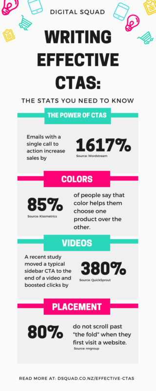
Include CTAs on your landing pages, emails, and within each piece of content that you send out. Emails with a single call to action increase sales by 1617%.
What Your CTA Should Look Like
We’ve all seen effective CTA buttons online; you don’t have to reinvent the wheel when you make your CTA. Create a rectangular button - but round the corners. Even though rectangles aren’t a physical threat, humans are turned off by sharp corners. A rounder shape is easier on the eyes. The button should be a contrasting color that still makes a good background for the copy.
Flat CTAs are confusing; users should be able to identify that the button is clickable. Add some depth to your CTA and add an effect for when the user hovers over the CTA. Even just changing the color of the text will send a signal that the user is able to click on the button and move to a new page.
The size of the CTA matters, but the size of the elements around the CTA will have more of an influence on how the CTA looks to users. Consider the overall design of the site when designing the size of the CTA. It should attract attention, but not overwhelm the user or take over the entire page. Remember that your landing pages, including your CTA button, should be compatible across all devices. If the CTA button is too obnoxious, hard to find, or hard to read, it will lose its effect.
Your CTA Copy
Now that you’ve got a pretty CTA to attract attention, you have to follow up with compelling copy inside the button, even if it’s just two or three words.
Keep your copy concise and clear, and tell users what they will expect from the next step. (You will have to write separate copy for each piece of copy that has a CTA.) A simple “click here” may get the job done, but it doesn’t give users an idea of what is happening next or why they should click in the first place.
Even a single word can make a big difference in your CTA copy; a study from ContentVerve showed that changing CTA copy from “share your free 30-day trial” to “share my free 30-day trial” increased click-through rates by 90%. Test out a few different options and see what your users respond to. The goals of your CTA copy will vary based on the content surrounding the CTA and who will be viewing it, but in general, follow these goals:
- Create a sense of urgency without putting pressure on the user (“Buy Now” is stressful; “Start your trial today” still gives users a timeline and a sense of urgency.)
- Speak to users in a language they can relate to (“Register” is more intimidating than “Sign up.”)
- Show users how they benefit from clicking (“Download your free eBook” is more effective than “Download Now"
Where To Put CTAs
There are two strategies behind the best placement for your CTA button: you could place it “above the fold” or further down on the page. If you have a simple landing page with a simple offer, place your CTA above the fold. Eye-catching buttons will attract a reader’s attention before they see anything else on the page. Four out of five users do not scroll when they first visit a website; if you hide your CTA, you may be missing out on these users.
The rules change if your landing page has a more complicated offer. A recent study from ContentVerve showed that buttons at the bottom of the page result in over 300% more conversions than buttons at the top. Buttons are the bottom of the page should still be easy to find with a bit of scrolling. Customers will click away if they have to search too hard for the CTA or wait too long for the whole page to load.
CTAs should stand out on your page, but they do not have to stand alone. If you put positive, trust-building copy around the CTA, users will be more likely to click. Include a concise testimonial around the CTA to build trust and give users proof that clicking on your CTA is a positive decision. Just make sure the area isn’t cluttered.
If you have video content, include the CTA in the video. These CTAs get 380% more clicks than a typical sidebar CTA.
Where Users Should Go Next
Once the user clicks, where are they going? The answer will depend on what the button is calling the user to do in the first place. Make the navigation clear and easy for the user. Sending a user to your general homepage is confusing, and doesn’t give users any direction about where to go next for their needs.
CTAs should direct users to a separate landing page that allows them to sign up, download content, or do whatever is in the next step. If you are offering a free download, direct users to a separate landing page that thanks them for taking the next step with your business. Use these landing pages as an opportunity to move the user even further through the buyer’s journey.
Conduct A/B Testing
A lot of CTA best practices are about finding the balance between an element that is too shy and one that is too obnoxious. The balance is going to be different depending on the industry you are in, the customers that you want to attract, and how far along the buyer’s journey each user is before you call them to action. There are no right or wrong answers about the best color or wording for a CTA.
The best way to find out what appeals to your customers is to test it out. If you are new to creating CTAs, try a few different styles and texts out before you decide on one for your website. Conduct a few different A/B tests to ensure that your website visitors are responding at the rates that you want. A/B tests put two CTA buttons head-to-head; the color, text, or placement of the button may be the only difference in the two pages, but it can have a serious impact on how many clicks you get in the future. Conduct multiple tests on different elements of your CTA until you find a combination of shape, size, text, etc. that generates an optimal amount of clicks.
A/B testing will fill in the details of what your customers are looking for. Let’s talk about color for a second. The color of your CTA button should contrast from the color of your landing page and direct website visitors’ attention to the CTA. Color is important; 85% of people in a recent survey said that color helps them choose one product over the other. But what color is best for your landing page? That’s something that A/B testing will tell you.
Boost Conversion Rates With Digital Squad, Your Top CRO Service Singapore
An effective CTA is one element of increasing your conversion rate and earning more revenue. Whether you are looking to generate leads or encourage more purchases, a high conversion rate will help you meet your growth goals.
The team at Digital Squad can help you boost your conversion rate with a thorough assessment of your digital marketing practices. Our experts can use their experience in SEO, content marketing, and other digital strategies and apply best practices to your landing pages, CTAs, and other elements of current and future campaigns. Let us also help you with remarketing, SEO services Singapore, AdWords marketing Singapore or even Facebook marketing Singapore and be on top of your digital game. We are more than an SEO agency. In fact, we can help you with your entire digital strategy.
Whether that be social media marketing Singapore, Google Shopping Singapore, Bing ads and Google display network ads, we are here to help you out. Contact us and find out how you can improve your conversions. Reach out to our team today to learn more about conversion rate optimisation with Digital Squad.


.png)
